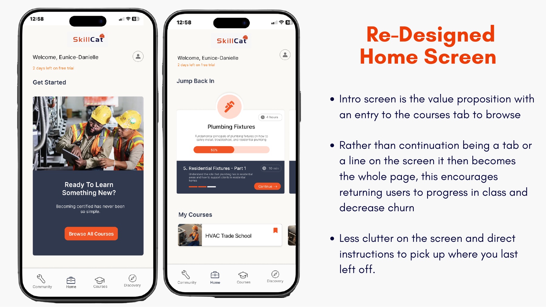
The Problem
The current home screen
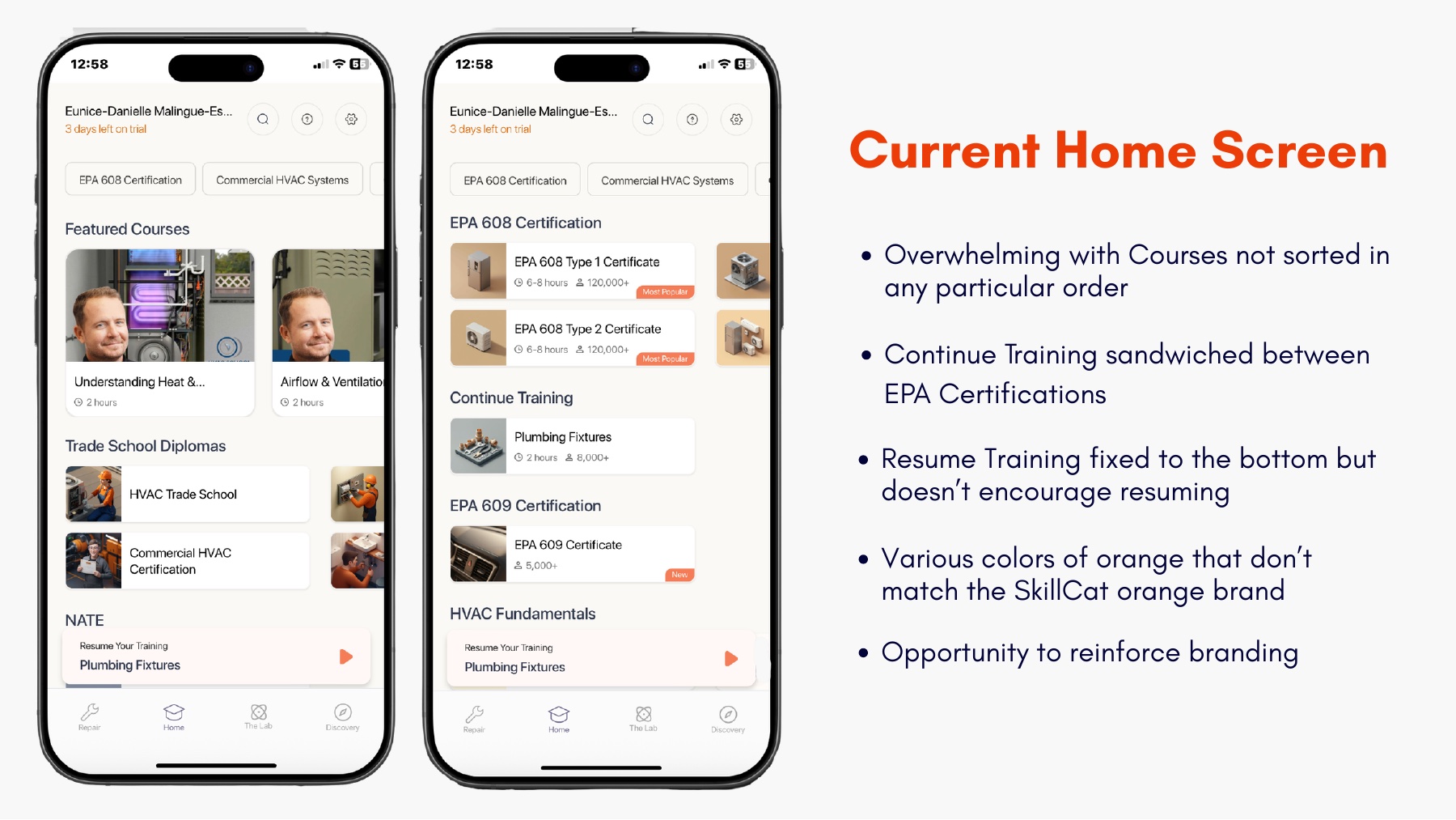
Overwhelming and unsorted
Courses appear in no particular order, and Continue Training is sandwiched between EPA certifications.
Resuming is buried
Resume Training is pinned to the bottom and does nothing to actually encourage you to pick back up.
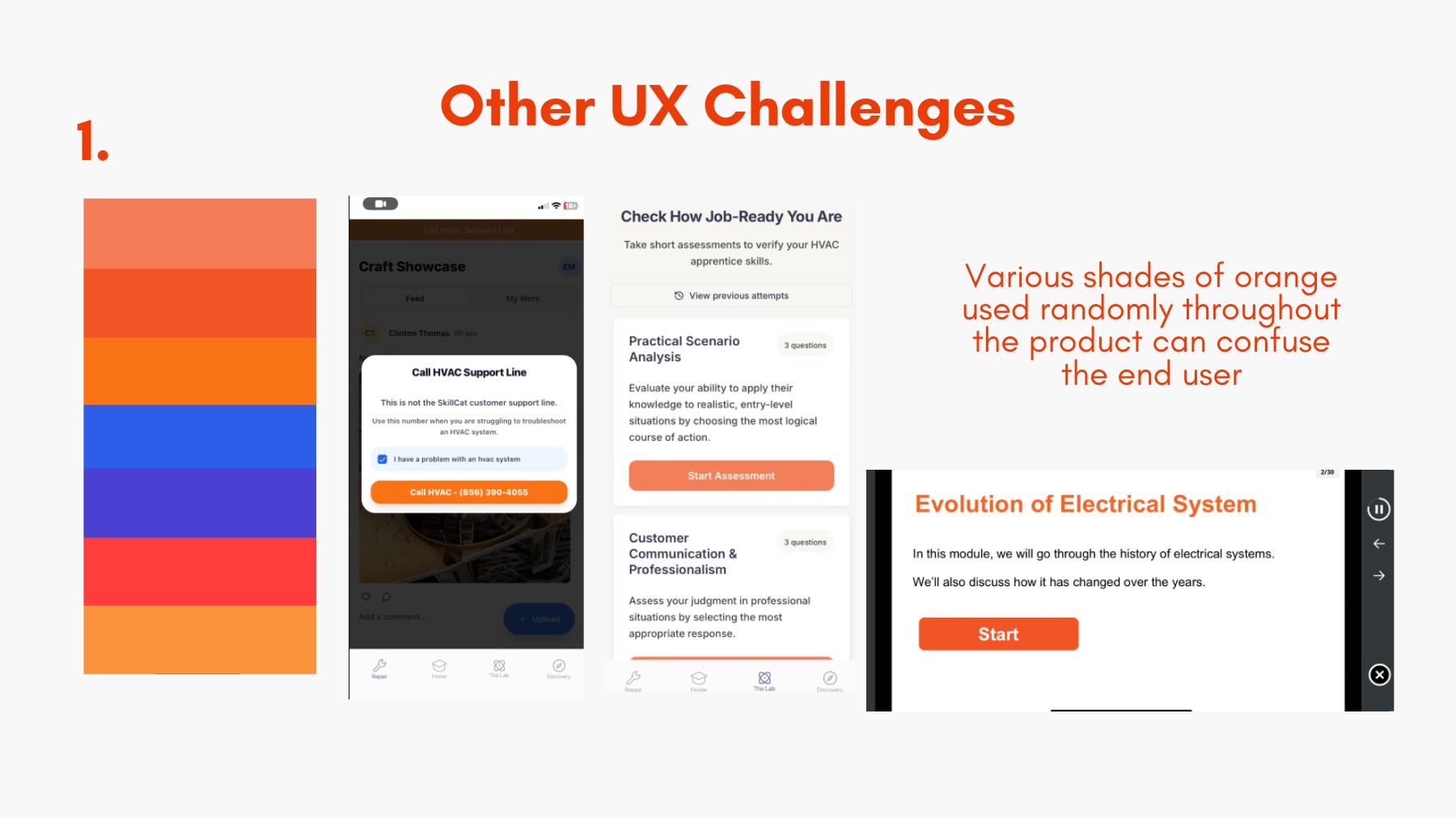
Off-brand color
Several random shades of orange clash with the real SkillCat brand and confuse the eye.
Confusing navigation
Tabs like Lab, Discovery, and Repair overlap and are hard to understand at a glance.